
Colorimetry
In this article :
Colorimetry is much more than a simple tool for measuring colors: it’s a true bridge between science and visual perception, between technique and aesthetics. It not only allows for the analysis of colors from a physical standpoint (wavelength, spectral composition…), but also helps interpret how colors interact with our environment, our emotions, and our image.
Today, colorimetry is at the heart of many fields: photography, printing, design, as well as personal styling and fashion. In the beauty industry, it helps determine which colors enhance a person’s features; in photography or graphic design, it ensures chromatic consistency across different media. Understanding colorimetry means learning to speak the language of color, to better choose, harmonize, and make the most of it.
Understanding the Fundamentals of Color
Before diving into the technical applications of colorimetry, it’s essential to understand how colors are constructed.
Primary, Secondary, and Tertiary Colors
Traditionally, we distinguish:
- Primary colors: red, blue, yellow (in subtractive synthesis – used in painting) or cyan, magenta, yellow (in additive synthesis – used in printing).
- Secondary colors: obtained by mixing two primary colors (green, orange, violet).
- Tertiary colors: obtained by mixing a primary color with a secondary one (e.g., red + violet = crimson, blue + green = turquoise…).
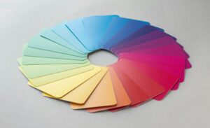
These mixes form the basis of all color charts used in colorimetry, whether physical (Pantone swatches, Munsell, etc.) or digital (RGB, LAB models, etc.).
Color Temperature: Warm or Cool?
The temperature of a color refers to the feeling it evokes:
- Warm colors: red, orange, yellow, golden beige… They evoke energy, sunlight, and warmth.
- Cool colors: blue, green, violet, gray… They suggest water, shade, and freshness.
However, the same hue can exist in both warm and cool versions. For example:
- A poppy red is warm, while a raspberry red (with violet undertones) is cool.
- A rosy beige is warmer than a grayish beige, which is cooler.
In colorimetry, this nuance is crucial: it helps determine which shades are best suited to a skin tone or a particular visual atmosphere.
Tools and Methods for Colorimetric Analysis
Colorimetry relies on analytical methods that make it possible to objectively assess color—whether in industrial, artistic, or image consulting contexts. Here are the main tools and techniques used depending on the application.
Physical Measurement Tools
The Colorimeter
A colorimeter is a measuring device that captures the light reflected by a surface in order to extract its colorimetric characteristics (brightness, hue, saturation, etc.). It provides precise values within various color spaces (such as LAB, LCH, RGB, etc.).
It is commonly used in photography, the textile industry, cosmetics, and printing to ensure color consistency across different media (screen, paper, fabric, etc.).
The Spectrophotometer
Even more precise, the spectrophotometer measures the intensity of light reflected by a color at each wavelength of the visible spectrum. It can detect the slightest differences between two shades, even when they are invisible to the naked eye. This tool is essential in high-precision fields such as laboratories, the pharmaceutical industry, and high-end printing.
Perceptual Tools: Draping Test and Visual Analysis
In the fields of image consulting and fashion, the approach is more visual than instrumental.
The Draping Test
Used by image consultants, draping consists of successively placing different colored fabrics around a person’s face under neutral lighting (daylight or calibrated white light). This method helps identify:
- Whether the person responds better to warm or cool colors,
- Whether they are enhanced by light or deep tones,
- Or by vivid or softened shades.
The goal: to establish a personalized color profile, often associated with a seasonal typology (winter woman, autumn man, etc.).
Intuitive or Comparative Analysis
In photography or visual creation, it is also possible to assess the accuracy of a color by comparison (using a color chart) or through intuitive analysis based on visual experience. Experienced photographers or graphic designers can perceive subtle differences in hue or undertone without the use of instruments.
Color Charts and Color Models
Standard Color Charts
- Pantone: Widely used in printing and fashion, the Pantone chart standardizes color communication across different professions.
- RAL: More common in architecture and industry.
- Munsell: An older system still used for its precision in three-dimensional color representation (hue, value, chroma).
Digital Color Models
- RGB (Red, Green, Blue): Used on screens.
- CMYK (Cyan, Magenta, Yellow, Black): For printing.
- LAB: More universal and device-independent, based on human color perception.
The 4 Seasons of Colorimetry
In image consulting, colorimetry is often organized around the model of the four seasons: spring, summer, autumn, and winter. Each season corresponds to a color harmony linked to a person’s natural characteristics (complexion, hair, eyes).
This system helps define the colors that brighten the face, soften features, and enhance personality.
🍂 Autumn:
- Complexion: golden, ivory, beige, sometimes with freckles
- Hair: red, golden chestnut, warm brown
- Eyes: green, hazel, amber, warm brown
Ideal palette: warm, rich, earthy tones like mustard, khaki, brick, terracotta, olive green, bronze, golden browns.
To avoid: cold colors, overly pastel or too bright shades, which can dull the complexion.
❄️ Winter:
- Complexion: very fair porcelain, olive, or deep dark
- Hair: black, dark brown, sometimes ash-toned
- Eyes: black, intense blue, steel gray, or deep brown
Ideal palette: bold, intense, and high-contrast colors such as black, pure white, electric blue, ruby red, fuchsia, emerald green.
To avoid: soft, pastel, or autumnal shades that lack sharpness.
🌷 Spring:
- Complexion: light, golden, peachy, easily flushed
- Hair: blond, light chestnut, soft copper
- Eyes: light blue, light green, golden hazel
Ideal palette: bright and warm shades like coral, salmon, lime green, light turquoise, camel, sky blue, Venetian blond.
To avoid: cold or too dark colors that can harden the features.
☀️ Summer:
- Complexion: porcelain, pinkish, sometimes slightly tanned
- Hair: ash blond, light chestnut, gray
- Eyes: gray-blue, soft green, light hazel
Ideal palette: cool, light, and soft colors like powder pink, lilac, lavender blue, pearl gray, mauve, muted teal.
To avoid: overly saturated warm colors or too strong contrasts.
Why know your colorimetry?
Knowing your personal color palette offers many advantages:
✔️ Naturally enhance your face without heavy makeup
✔️ Make more targeted purchases (clothing, accessories, makeup)
✔️ Build a cohesive wardrobe
✔️ Strengthen the impact of a professional or personal image
✔️ Save time and avoid fashion mistakes
Conclusion
Colorimetry is much more than an aesthetic concept: it is a visual science serving identity. Whether you are a photographer, image consultant, stylist, or simply curious to better understand yourself, understanding colorimetry allows you to reveal the best of every face, in light and color.
Jérémy Carlo is the editorial director at Rétines, where he ensures the consistency and clarity of all content produced by the studio.
Our Clients


Let’s discuss
What we do for you at Rétines
Meticulous work, an organised project and fast delivery. And to achieve this, we mobilise the right resources in our teams at the right time.
01
Pre-production
Artistic and technical direction tailored to the project.
Relevant recommendations on content, form and resources.
02
Photo Shooting
Photos taken by our experienced photographers.
Production that’s controlled, efficient and tailored to the needs of the project, with nothing superfluous.
03
Retouching
Technique
Photographs magnified by our retouching team.
Post-production to meet the commercial challenges of the brief.